

Visual degree mapping turns your major requirements into a graph or timeline you can actually see: courses as boxes, prerequisites as arrows, terms as columns, so you know exactly what to take and when. The immediate next step is simple.
- Pull your official degree audit, your current transcript, and any AP or transfer credit report before you draw a single box.
Treat any map you build as a planning draft, not a final answer. Confirm it against your official degree audit and your academic advisor before you register for anything.
Key Takeaways
Visual degree mapping works because it turns dense catalog prerequisite logic into a graph you can check for bottlenecks before registration, not after.
| Point | Details |
|---|---|
| Start with documents, not design | Collect your degree audit, transcript, and AP/transfer report before drawing any boxes. |
| Map prerequisite logic explicitly | Show AND/OR relationships so bottleneck courses are visible early, not discovered at registration. |
| Choose the right visual format | Use timelines for pacing, dependency graphs for prerequisites, and kanban cards for term shuffling. |
| Verify with official sources | Cross-check every map against your degree audit, catalog, and advisor before trusting it. |
| Keep the map current | Rebuild it after each registration cycle; tools like Univyze automate prerequisite and credit updates. |
Table of Contents
- What Is Visual Degree Mapping, and Why Does It Help?
- Where to Find Official Degree Maps for Your Major
- How to Build a Term-by-Term Visual Degree Map
- Templates and Visual Formats You Can Copy
- Common Pitfalls in Visual Degree Mapping (and Fast Fixes)
- Estimating Your Timeline to Graduation
- Using Visual Degree Maps With an Advisor or Parent
- How a Degree-Planning Dashboard Supports This Work
- Plan Smarter With Univyze
- Sources
- FAQ
What Is Visual Degree Mapping, and Why Does It Help?
A visual degree map is a graph or timeline that converts the dense paragraphs in your course catalog into something you can look at and immediately understand. Instead of reading “prerequisite: MATH 201 or MATH 205 with a grade of C or better,” you see a line connecting two boxes with an “or” label between them. University degree maps typically appear as sample term-by-term plans or guided pathways, not binding contracts, so they’re meant to be adapted to your situation.
The benefits show up fast once you build one:
- You spot prerequisite chains before they trap you in a five-year plan.
- Bottleneck courses (the ones every other class depends on) become obvious.
- You can test “what if I switch minors” scenarios without redoing your whole schedule.
- AP credits, dual-enrollment units, and transfer credits slot into the timeline instead of floating as question marks.
- Advisors and parents can glance at one page instead of parsing a 40-page catalog PDF.
Pro Tip: Missing one prerequisite in your sophomore fall can push a required senior seminar back an entire year. A visual map catches that gap two years early, while a text-based checklist usually doesn’t.
Every map still needs a reality check against your official degree audit and your advisor’s sign-off.
Where to Find Official Degree Maps for Your Major
Most universities already publish something close to a visual degree map. You just have to know what to collect and where to look.
Start with these five documents:
- Your official degree audit (sometimes called DegreeWorks, STARS, or a similar audit system).
- The university catalog page for your specific major and catalog year.
- Your current transcript, including in-progress courses.
- Your AP, IB, or transfer credit evaluation report.
- The upcoming term’s course schedule of offerings.
Ask your academic advisor first, since they can point you to department-specific plans that don’t always surface in a general search. Department undergraduate coordinators and the registrar’s office are your next stops, and most campus websites host a page for this under one of several names: “degree map,” “academic map,” “program guide,” or “sample four-year plan.” Knowing those terms in advance saves you from searching blind on your school’s site. If your major has general education requirements tied to a system-wide policy, like the CSU GE requirements, check that page directly rather than trusting a secondhand summary.
How to Build a Term-by-Term Visual Degree Map
Building your own map is a documentation exercise before it’s a design exercise. Follow this order:
- List your milestones first. Write down every major requirement, GE area, and minor or concentration requirement as a standalone box, without worrying about term placement yet.
- Add prerequisite arrows. Connect each course to whatever it requires. Note “AND” and “OR” logic explicitly. Tools built for this, like TreeDegree, render prerequisites as logic gates so a course requiring “MATH 201 or MATH 205” looks visibly different from one requiring both.
- Identify bottleneck courses. Any course that unlocks several later classes deserves early placement. This is where turning catalog prose into structured logic actually pays off. It reveals alternate paths and choke points that plain text hides.
- Fill in your terms. Place milestone courses first, then electives, then GE courses around the fixed points.
- Layer in outside credit. Mark where AP scores, dual-enrollment courses, or transfer credits satisfy a requirement, so those boxes show as already complete.
For each term, capture the credit load, whether the course is core or elective, and whether it satisfies a distribution requirement. Watch for two things in particular: courses only offered fall or spring (not both), and lab sections with limited capacity that fill within hours of registration opening.
Pro Tip: Don’t stack two bottleneck courses with heavy lab components in the same term. A visual canvas that includes the academic calendar makes uneven workload distribution obvious before you commit to a schedule.
- Balance 15 to 17 credits per term unless you have a documented reason to overload.
- Slot AP and dual-enrollment credit into term one or two so downstream planning reflects your real starting point.
- Leave one elective slot flexible per year in case a required course gets rescheduled.
Templates and Visual Formats You Can Copy
A typical four-year sample plan front-loads GE and foundational courses in years one and two, layers in the major sequence through year three, and clusters upper-division and capstone work in year four. That’s the skeleton. The format you wrap around it depends on what you’re trying to see.
- Timeline view: best for pacing across eight terms at a glance; use this to check credit load balance.
- Dependency graph: best for prerequisite chains, since it makes AND/OR logic and bottleneck courses visible the way TreeDegree’s approach does.
- Kanban or term cards: best for moving courses between terms as your plan changes, similar to how a visual curriculum planner lets you drag units around a single canvas.
- Mind-map branches: best when you want to zoom between big-picture sequencing and lesson-level detail; mind-mapping tools handle that zoom well.
A simple color legend keeps any of these readable: one color for required major courses, one for prerequisite chains, one for electives, one for GE, and one for AP or transfer credit already earned. Export a screenshot or PDF of your current map before every advising meeting. It gives you both something concrete to point at during the conversation.
Common Pitfalls in Visual Degree Mapping (and Fast Fixes)
The biggest planning mistakes are quiet ones. You don’t notice them until registration week two years from now.
Watch for these red flags:
- Misreading “OR” as “AND” in catalog prerequisite language (this alone causes most unnecessary extra semesters).
- Building a map against last year’s catalog after your requirements changed.
- Overloading one term because a plan “looked fine” on paper.
- Assuming a course will be offered next fall just because it was offered this fall.
- Forgetting that upper-division courses often require junior or senior standing, not just a completed prerequisite.
The fixes are just as quick: confirm ambiguous catalog wording directly with the department, spread heavy course clusters across terms instead of clustering them, and register the moment your window opens for any bottleneck class. If an elective placeholder falls through, swap in an alternate from your GE list rather than leaving the slot empty. Mark pending AP or transfer credit clearly on your map until it’s officially posted. Treating pending credit as confirmed is a common way plans quietly fall apart.
Estimating Your Timeline to Graduation
Before you trust any plan, run it against a short checklist: total credits earned versus required, upper-division credit count, residency requirement, any unmet prerequisites, whether your remaining courses are actually offered in upcoming terms, and minor or concentration requirements if you’re carrying one.
Run quick what-if checks whenever something changes. If you miss a bottleneck course this term, does your graduation term shift by a full year or just a semester? If a transfer credit posts late, does it unlock a course you thought you needed to take in sequence? These checks take minutes on a visual map and hours on a spreadsheet.
Before assuming any plan is solid, verify total credit count, GE certification status (a good moment to double check against official GE requirements), and course availability directly with your registrar or degree audit system.
Using Visual Degree Maps With an Advisor or Parent
A visual map is only useful if the people helping you can actually read it. For advisors, that means walking through a short checklist each meeting: confirm the student’s catalog year, verify that transfer and AP credit posted correctly, flag bottleneck courses that need early registration, and review sequencing around major milestones like a capstone or thesis.
Parents get more value from progress metrics than course names. Ask what percentage of requirements are complete, whether the plan has a backup for missed courses, and what changes if a major switch happens sophomore year.
For meetings, bring a printed or exported version of the current map, mark two or three alternate terms for flexible courses, and lead with the bottlenecks instead of burying them in the middle of the conversation.
How a Degree-Planning Dashboard Supports This Work
A dashboard built specifically for this job does the manual assembly work for you. Univyze links your degree requirements to real course offerings, so prerequisite chains, AP and transfer credit, and dual-enrollment units show up automatically instead of requiring you to redraw arrows every term. You can run a what-if scenario, like adding a minor or dropping a course, and see the downstream effect on your graduation term immediately.
Picture a sophomore who assumes a required lab science is offered every semester. A dashboard that flags the actual offering pattern surfaces that conflict a full year before registration week, giving the student time to adjust rather than scramble. That’s the kind of catch a static PDF plan won’t make for you.

None of this replaces your official degree audit or your advisor. Treat any dashboard output as a planning draft to verify, not a final word on your requirements.
A Habit Worth Building
I think the students who graduate on time aren’t the ones with the fanciest map. They’re the ones who actually update it. Rebuild your visual map right after each term’s registration closes and after any audit change lands.
Plan Smarter With Univyze
Static PDFs and catalog spreadsheets get outdated the moment your requirements shift or a class fills up. Univyze keeps your plan current automatically, connecting your degree requirements to real, term-by-term course offerings so you see prerequisite chains, AP credit, dual-enrollment units, and transfer credits in one dashboard instead of five disconnected documents.
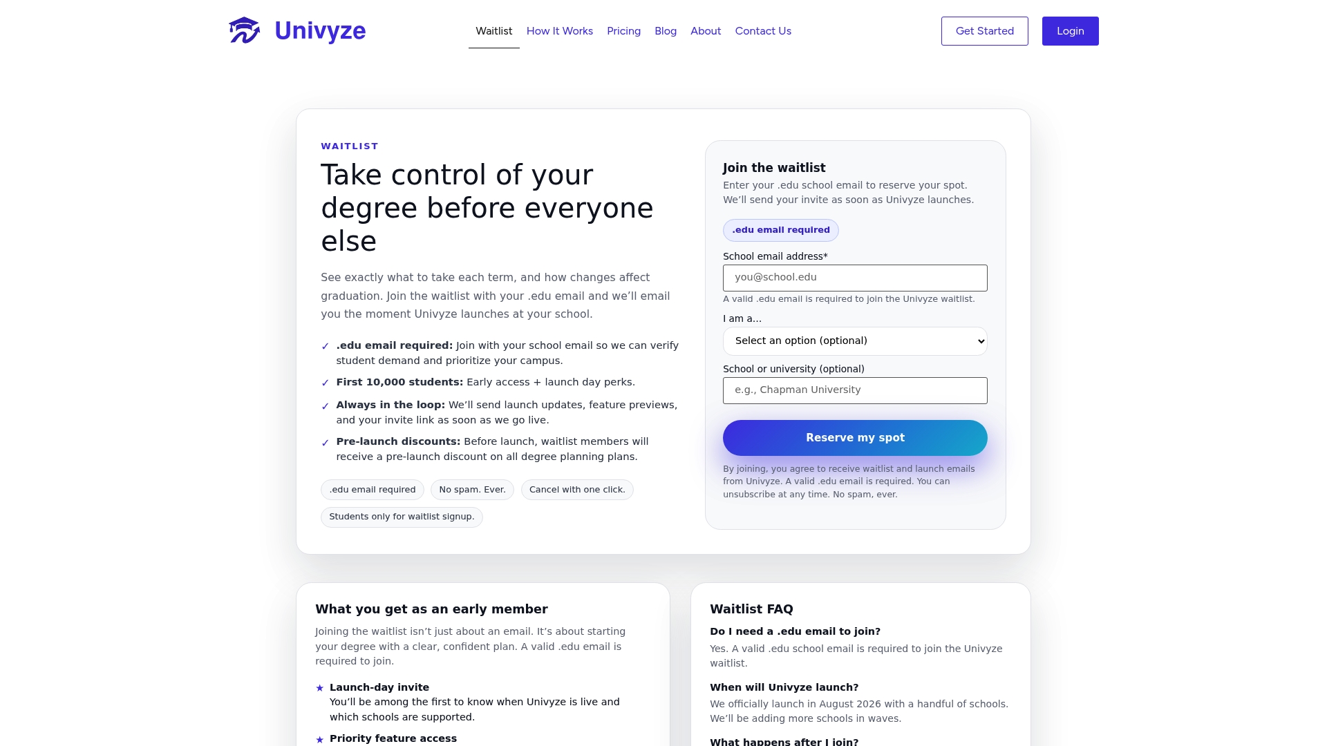
It’s a planning aid, not an official degree audit, so keep confirming your requirements with your school’s degree audit, catalog, and academic advisor as you go. If you want to see how term-by-term planning works before your next registration window, join the Univyze waitlist and get early access when it opens.
Sources
- Degree Maps – School of Interdisciplinary Arts & Sciences
- Sidd-Patil/TreeDegree
- Curriculum Planner – Map a Whole Course Visually | Storyflow
- Curriculum planning and mapping | MindMeister
- CSU General Education (GE) Requirements | Academic Planning & Programs
FAQ
What Is Degree Mapping?
Degree mapping is the process of laying out every course you need for your major, minor, and general education requirements across your remaining terms, usually as a visual timeline or graph rather than a plain checklist.
What Profession Studies Maps?
Cartographers and geographers study physical maps professionally, but academic degree maps are built and maintained by academic advisors, registrars, and curriculum coordinators, often with input from degree-planning software.
How Do You Do Course Mapping?
Start by listing your milestone requirements, add prerequisite arrows between courses noting AND/OR logic, identify bottleneck courses that unlock multiple later classes, then place everything across terms while balancing credit load.

What Is a Map in College?
In college, a “map” usually refers to a degree map, academic map, or sample four-year plan: a document or visual tool showing the recommended course sequence for completing a specific major on time.
Can a Visual Degree Map Replace My Advisor?
No. A visual degree map is a planning tool that should be checked against your official degree audit and confirmed with your academic advisor before you register for courses.